


 Browse all our services


A Friendly Guide to Choosing Typography That Makes Your Website Visually Appealing
Choosing the right font for your website isn’t just an aesthetic decision — typography plays a key role in delivering your message and creating a lasting impression on users. In this guide, we’ll help you understand how to find a font that aligns with your brand and ensures a pleasant user experience.
Why Typography Matters
Fonts are more than just letters on a screen — they shape the entire user experience. The right font can boost visitors’ trust in your brand, while the wrong one can distract and leave a negative impression. For example, serif fonts like Times New Roman convey elegance and tradition, while sans-serif fonts like Arial feel more modern and minimal. Typography is the bridge between visual appeal and website functionality.
Understanding Brand Personality
Before diving into the world of fonts, ask yourself: What message should my website convey? If your brand is serious and professional, go with classic serif fonts. For brands that lean into innovation or creativity, feel free to explore modern and experimental fonts. The key is to ensure your typography aligns with your brand’s tone and identity.
Readability Comes First
Visual appeal should never come at the expense of practicality. The font you choose must be easy to read across all screen sizes. Avoid overly decorative fonts for longer texts, as they can tire the reader. No matter how beautiful a font is, its main job is to deliver clear and easy-to-understand information.
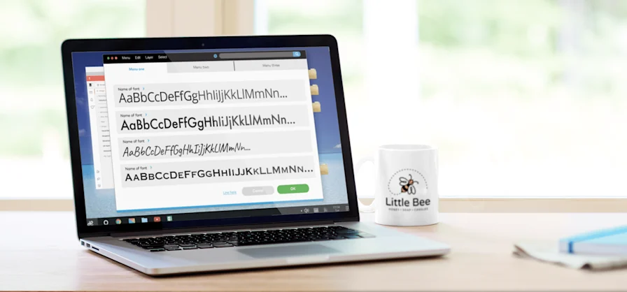
Practical Tips for Choosing Fonts
- 1. Use a maximum of three fonts: One for headings, one for body text, and optionally a third for highlights.
- 2. Pay attention to contrast: Fonts for headings and text should complement, not compete with each other.
- 3. Test on different devices: Make sure the font looks good on phones, tablets, and desktop screens.
- 4. Check language support: If your site has a multilingual audience, the font should support all necessary characters and letters.
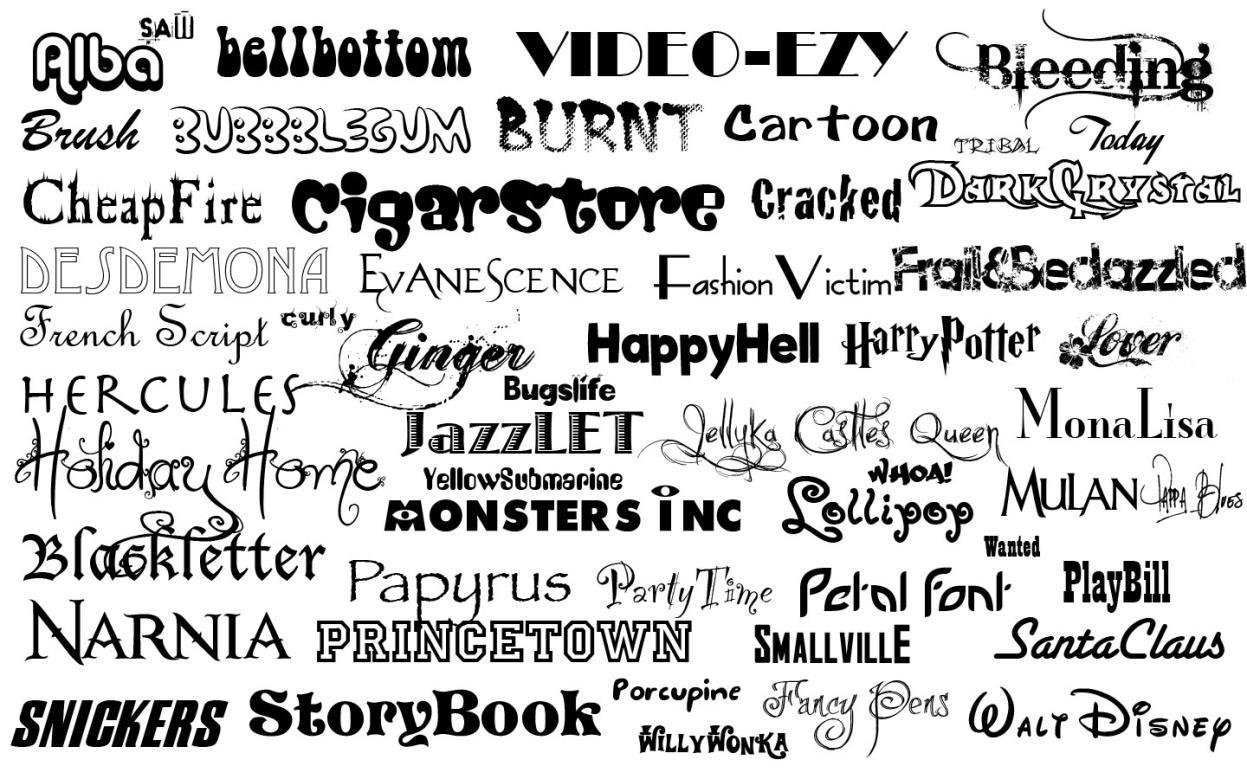
Popular Fonts for Inspiration
If you're not sure where to start, here are some suggestions:
- 1. Sans-serif: Roboto, Open Sans, Lato
- 2. Serif: Merriweather, Georgia, Playfair Display
- 3. Display fonts: Lobster, Pacifico, Bebas Neue
Conclusion
The right font combines aesthetics, functionality, and your brand’s personality. When visitors land on your site, the font should guide them effortlessly through the content while giving the right vibe about your brand. Take the time to explore options, test them, and tailor them to your site. As designers say: "Typography is the voice of your text — make it sound great!"