


 Browse all our services


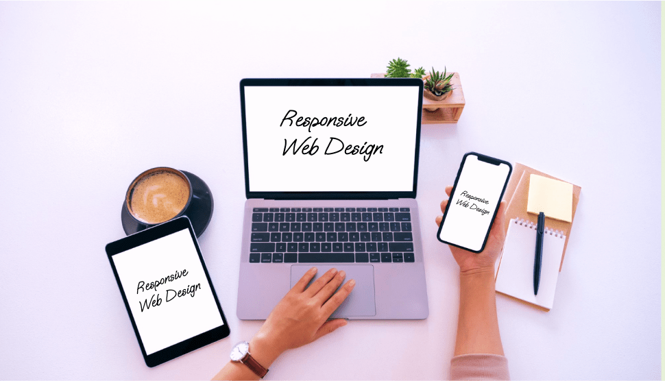
Simple Explanation of Responsive Design
Responsive design is now the standard in web development, but what does it actually mean to be "responsive"? Simply put, responsive design allows a website to automatically adjust to different screen sizes and devices, from desktop computers to smartphones. This is essential for providing an optimal user experience regardless of how visitors access your site.
How Does Responsive Design Work?
Responsive design uses flexible grids, proportions instead of fixed units, and CSS media queries to ensure all page elements adapt to different devices.
Key elements of responsive design:
- 1. Flexible grids: Instead of using exact pixels, the design is based on percentages that adjust to the screen size.
- 2. Adaptive images: Images automatically scale to fit the device frame without losing quality.
- 3. Media queries: CSS rules that enable specific styles for different screen sizes.
Why Responsive Design Matters?
Nowadays, over 60% of internet traffic comes from mobile devices. If your site isn't optimized for smaller screens, you risk losing a huge number of visitors. Additionally, Google uses mobile-friendliness as a ranking factor in search results.
Benefits of responsive design:
- 1. Improved user experience: Visitors can easily navigate regardless of the device.
- 2. SEO advantages: Google favors sites optimized for mobile devices.
- 3. Lower maintenance costs: Instead of separate desktop and mobile versions, you have one site that adapts to all.
How to Create a Responsive Website?
- 1. Use a mobile-first approach: Start designing for the smallest screens and gradually add elements for larger screens.
- 2. Focus on simplicity: Responsive design doesn’t work well with complicated layouts.
- 3. Test on multiple devices: Use tools like Google’s Mobile-Friendly Test or Chrome DevTools to check how your site looks on different screens.
- 4. Optimize performance: Loading speed is as important as design. Compress images, use a CDN, and optimize your code.
Myths About Responsive Design
GIMP (GNU Image Manipulation Program) is a powerful photo and graphics editing tool. A great Photoshop alternative, it allows you to:
- 1. Myth 1: Responsive design is expensive: While it requires expertise, in the long run it's more cost-effective because it reduces the need for separate sites.
- 2. Myth 2: Only big websites need it: Every site, regardless of size or purpose, can benefit from adaptability.
- 3. Myth 3: Responsive design means “just resizing”: It also involves adapting functionality, like menus and interactive elements.
Conclusion
Being "responsive" in website design is not just a trend but a necessity in today's digital world. With responsive design, your site will not only look modern but also be functional and accessible to all users. Investing in such design brings multiple benefits: more visitors, better Google ranking, and easier maintenance. If you haven't done it yet, now is the time to make your website responsive!